TAST tool Menu
TAST Adaptors
Adaptors examples
TAST Integrations
Interesting features
Documentation of technical administration
Modeling recommendations
Training in the TAST tool
TAST tool Menu
TAST Adaptors
Adaptors examples
TAST Integrations
Interesting features
Documentation of technical administration
Modeling recommendations
Training in the TAST tool
This functionality is available only for those clients who need monitoring of production.
The Monitoring menu is divided into two functionalities:
Within this functionality, there are the options of: Dashboard, Errors and Performance.
The Dashboard menu is an option within TAST that can be accessed from the left navigation by clicking on Monitoring and selecting Dashboard.

Once you click on the option you will be taken to the following menu:

In this page we have at the top right a refresh button to get the most recent data without reloading the entire page. Below, we have two date and time selectors, which are used to access data belonging to a time interval, this action refreshes the data. These fields are not mandatory. The start date cannot be greater than the end date.
Below the dates are the monitoring graphs, which represent the data corresponding to the parameters entered.
Under the graphs there is a box containing the total number of messages not processed, total number of ok messages, total number of warning validation messages and total number of error validation messages. This values depends on the systems selected.
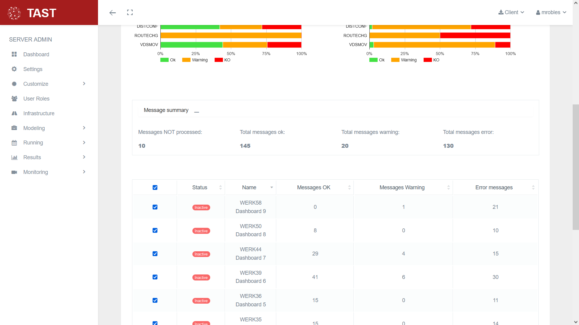
Finally, you have the table of monitored systems, which can be selected or deselected with the checkboxes to choose the messages of which systems you want to see in the graphs.
All systems can be selected or deselected using the checkbox in the table header.
Selecting or deselecting systems updates the data.
This table also shows the number of validation messages for each system.
The messages not processed are not displayed within these values.
These tables can be accessed through the left menu with the options located under dashboard, or through the dashboard graphics.

In the tables there is a refresh button in the upper right corner to reload the data and a download button to download the data belonging to the selection in CSV format.
Below is an input field in which you can enter a query to select data based on a specific criterion. This field will already be filled in if you have previously clicked on one of the dashboard charts. In addition, you can double click on any of the elements displayed in the table to automatically complete the query with that selection. At the right of the input field there is a button to delete the input field and a button to perform the search.
The performance table has the same characteristics but shows different data.
These tables can be accessed through the left menu with the options located under dashboard, or through the dashboard graphics.
In the tables there is a refresh button in the upper right corner to reload the data and a download button to download the data belonging to the selection in CSV format.
Below is an input field in which you can enter a query to select data based on a specific criterion. This field will already be filled in if you have previously clicked on one of the dashboard charts. In addition, you can double click on any of the elements displayed in the table to automatically complete the query with that selection. At the right of the input field there is a button to delete the input field and a button to perform the search.
